
Like it or loathe it, in the bustling corridors of the internet, there’s one marketplace that stands as a colossus: Amazon. In the US it accounts for 38 per cent of the eCommerce industry, and for consumers it’s the go-to for everything from the latest gadgets to kitchen cupboard staples. If you’re an eCommerce player, customers expect to find you on Amazon too.
It’s a fantastic way to access almost unlimited traffic, all coming with intent to buy. But competition is fierce, there’s battle for conversion and organic search – your key defences against rampant advertising costs. Many companies excel at creating stunning websites but treat their Amazon listings as an afterthought. Not only does this lose sales, it can also damage your brand.
We all shop on Amazon, so we think we know how it works. But are we really paying attention. There are five key elements of an Amazon listing. As seller, it can really pay to get a deep understanding of the role they play and how they all fit together to boost conversion.
Let’s dive into how you can make your Amazon listing not just good, but great.
People are still people
The first thing to remember is that shopping habits don’t change drastically between platforms. The principles that work on your website are just as effective on Amazon. The difference is that you’re playing by Amazon’s rulebook, which means adapting your strategy to their format.
The five elements of every Amazon listing are
- Title
- Bullets
- Images
- Brand Story
- A+ (formerly known as Enhanced Brand Content or EBC)
Let’s have a look at each one in turn.
Crafting the Perfect Amazon Title
Amazon keywords are king. They’re not the same as Google keywords, so make sure you research, ideally with a tool like Jungle Scout or Helium 10. The more words you can get into the title, the better chance you’ll have of getting higher up in the search rankings.
However, the algorithm doesn’t like keyword stuffing, and neither do consumers. Crafting your 200 character title is a mix of art, science and storytelling. If you have a lot of very similar products, such as cameras, or bath oils, develop a taxonomy, so that key attributes are always in the same place within the title, to help your customers compare and build trust.
Building magical bullets
If your web copy is well-written and performing well, you can repurpose it. There are some great AI tools that will do this for you.
Alternatively, if you’re starting from scratch, then a good place to start is with reviews of similar products. Pop a few into ChatGPT to do the analysis for you. You can also get it to look at the negative reviews, so you can turn those into positive attributes.
Treat the start of each bullet point as a mini-headline for an ad, leading on the benefit and following up with the features. Putting the first few words in capitals helps to make it scannable. Think about the storytelling and funnel your reader through from one to the next. And add in as many keywords as you can.
Pictures that sell
This is the area that tends to get most neglected – which also gives you the most opportunity. Once you’ve worked out your bullet points, think about how to illustrate these with images. Obviously you need some high quality product shots from various angles and lifestyle images.
Amazon rules state that the first image must be on a white background, with the product only. However, you can sometimes get away with adding lifestyle elements. Even just a few leaves next to leaf blower, USB cables next to an electronic device or a baby next to a pack of wipes will almost certainly improve your conversion. Sometimes you’ll get them through, sometimes you won’t, but it’s worth a try.
A picture is worth a thousand words, especially on Amazon, but adding words makes them even better. In AB tests for my own Amazon business, Pet Trading Post, longer copy led to higher sales. Follow the same storytelling as your bullets.
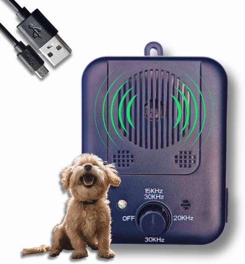
Adding lifestyle elements to your main image can improve conversion
A picture is worth a thousand words, especially on Amazon., but adding words makes them even better. In AB tests for my own Amazon business, Pet Trading Post, longer copy led to higher sales. Follow the same storytelling as your bullets.
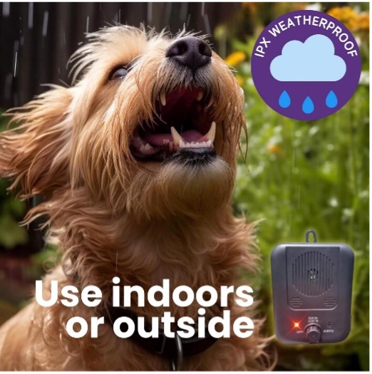

Longer copy performed better in AB tests
Unfortunately you can’t put customer quotes from reviews on any more but you can repeat the key benefits. Add icons and infographics. Use it to add information that could help reduce returns, such as a size guide.

Infographics can be very powerful on Amazon images
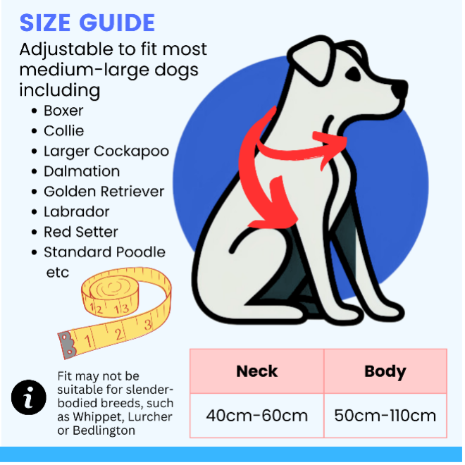
This size guide was designed to help minimise negative customer reviews
Videos also give a significant boost to your listing. Add as many as you can without being repetitive, and when you upload, give them a clear title that tells the reader what they’ll see and why they should watch it.
Those are the three core elements that make up a listing above the fold, but there are some real juicy gems below the fold that often get overlooked.
The Brand Story carousel
The Brand Story is the place to share your journey, the why behind your brand, or the passion that drives your products. It’s a customer-driven carousel of up to 20 cards of text or images.
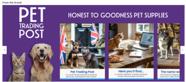
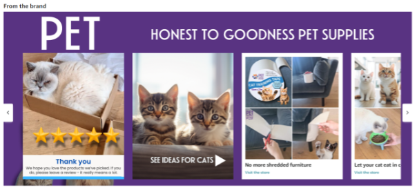
The interactive Brand Story, showing a mix of image cards and clickable cards
Some click straight through to a product or to your storefront. As you can imagine, this is very good for search. Plus if you can get a customer on to your Amazon store, they are away from the distractions of competitor ads.
However, you can use the brand story for other purposes, depending on your brand. For one client, selling a label printer, we recommended using it to create a step by step guide to show how easy it is to set up. The interactive nature was perfect for this.
Leveraging A+ Content and Comparison Charts
A+ content is your canvas to paint a detailed picture of your product. Use it to expand on features, delve into the benefits, or tell the story behind your creation. I also find this is a good place to build the emotion that helps get people attached to your brand. Take your cues from how you portray your brand on your website, packaging, ads and in-store.
How you use it really depends on the type of product. If you have a complex product like a retinol serum, or a high end camera, it’s perfect to go into a lot more detail than you have space for in the bullets.

This A+ includes emotional lifestyle images as well as expanding on the product features
One of our best-sellers at Pet Trading Post is a cat bowl that has 3 legs that the customer has to assemble. We noticed that competitor reviews often mentioned how tricky this was, so we made a feature of it by including photos showing how to attach them. Not only does it reduce returns but it also helps the customer feel involved in their purchase.
Always include the comparison chart, a great place to upsell and cross sell, as well as being another boost to organic search. This feature is available on standard A+ and Premium A+ in different formats, although you can’t mix and match.
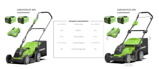
A Premium A+ chart to help customers understand key differences of similar products
A+ can also be a good place to talk about charity donations, or eco philosophy. A word of warning though. Amazon has a lot more rules about what you can and can’t say here. Words like accredited or certified can trigger rejection.
How does your listing measure up?
Here’s a quick checklist for your own Amazon listings.
- TITLE – up to 200 characters, keyword rich
- BULLETS – up to 1000 characters in total, benefit led, scannable.
- IMAGES – at least 7 plus video(es). Curate to match the framework used for the bullets, and use text and icons where appropriate
- BRAND STORY – use image cards to expand on your brand heart, and add clickable cards to showcase your bestsellers and drive traffic to your store
- A+ – expand on your product features
- Comparison chart.
If you tick all the boxes, well done. You’ve got a great start for improving your organic search, lowering your ACOS and increasing your ROAS. (Advertising Cost of Sale and Return on Advertising Spend). Now’s the time to start using Amazon’s AB testing tool to get even better.
I hope this helps you get more juice from your Amazon listings. Please comment if you have any questions or to share if these tips help you improve your Amazon presence.


Share